How we designed and developed a tool to present user research in an informative and accessible way
You’ve probably had this problem
Time and money has been spent on fresh customer research and when the results come in, it’s the best thing since sliced bread! The possibilities seem limitless. Fast forward a couple of months and that excitement is a distant memory. The reports and research are now buried deep in your intranet, never to be found again.
We believe we’ve found a solution. We call it an “Ecosystem Map”.
An Ecosystem Map is a way to capture your operations, tasks and pain points - and then map an ecosystem around your product. This visual ‘map’ benefits larger companies in industries with complex processes, like farming, commerce or pharmaceuticals.
Creating a Clear Pathway
Let’s say, an ecommerce company conducts a research project on their entire product lifecycle. It covers the conception, manufacture and even logistics of the product. The Ecosystem Map provides an holistic, clear way to visually represent the business and/or individuals involved, their desired tasks, and their pain points. It allows you to see the ecosystem from a bird’s eye view, providing opportunities to improve the current state of the business.
How it came about
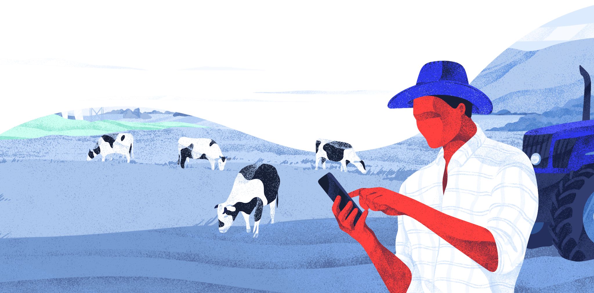
The idea was born in a meeting room with our client, a large agricultural business. They wanted to better understand farmers, their environment and the systems they use.
As well as our customer’s needs, the project focused on providing the client with the ability to educate teams that User Experience (UX) should live at the very soul of a company. We saw an opportunity to use our skills in research, design and development to provide real value. To see what was possible - together.
This was un-chartered territory. No one knew what exactly what deliverables were needed just yet, and that was ok. We didn’t know what would come from the research, which was fine too. We've noticed some companies get stuck on deliverables and try to shoe-horn well-known methodologies into places that they shouldn't always sit. Working with our client we had the opportunity to tailor the outputs and challenge the status quo.
The solution
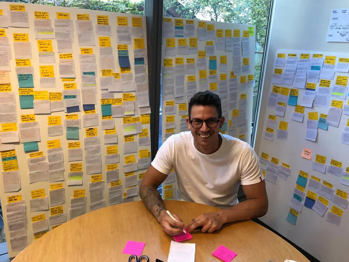
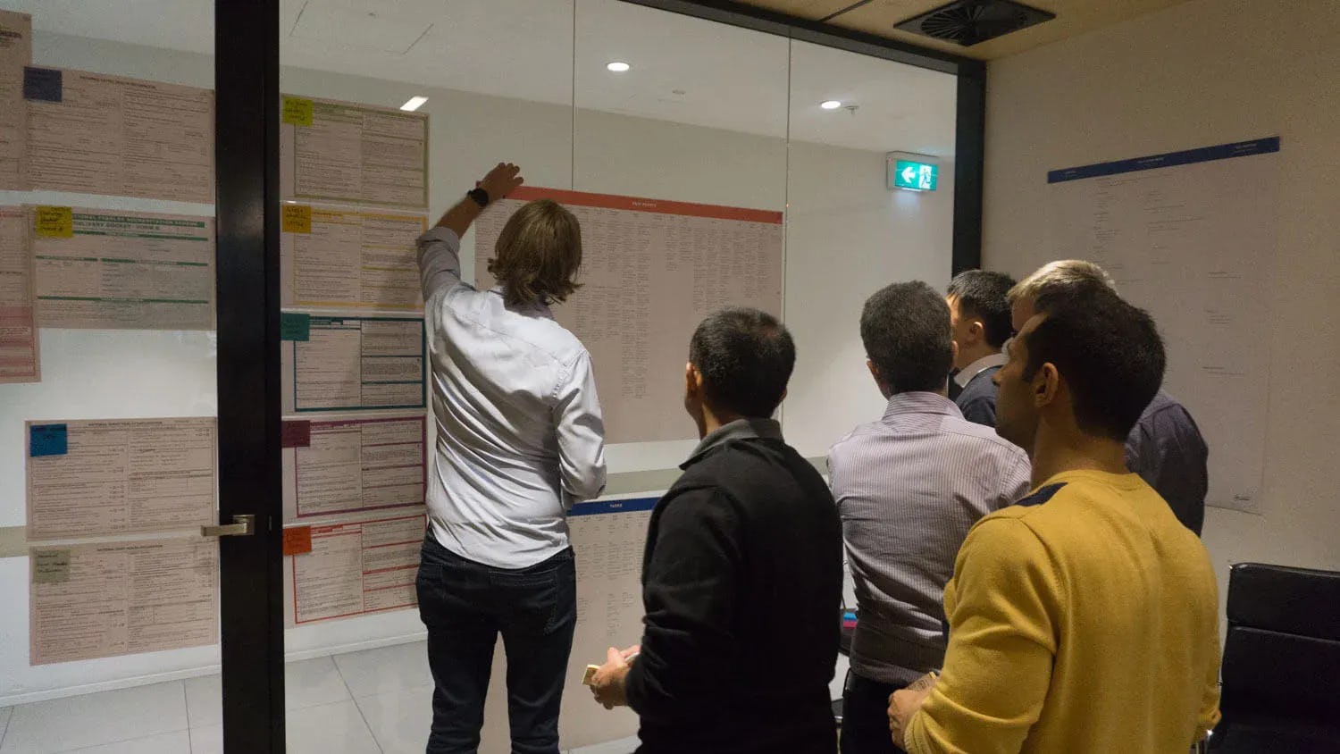
After twenty contextual inquiries and a mammoth 3-week affinity map, we had too much information. Our challenge was to find a way to condense and categorise the huge amount of research into a client-friendly format.
First, we designed a super cool isometric visual of all operations in farming to give a high-level view of the farming ecosystem to anyone looking at it, even if they didn't have a background in the sector.
Then a tree-loving genius came up with the idea of taking these large print-outs and digitising them.
How we made the digital tool (techy bit)
We only had a few weeks before our Design Thinking Workshop, where we would present our ideas. Our dev and design team agreed to use a spreadsheet as the database. This would simplify the code needed to let a user add, edit and delete data.
Google Sheets was initially explored, but their API (or tools for building software) didn’t allow for record tagging, which was essential to create relationships between operations, pain points and tasks.
Plus - importantly - the client only used Microsoft products, leaving us with zero Google account users.
Enter Airtable. Not only were their APIs simple and easy to implement, but Airtable also supports record tagging and can run off authentication.
Eureka! It’s always a good feeling when you find an awesome solution to fit your exact needs.
Managing the Data
In the front-end, we used Facebook’s React to handle interactions between the operation tooltips and Airtable’s API. We exported the isometric visual from Sketch as an SVG and embedded the SVG code into the React website. The first SVG export was huge (9MB)!! If you remove patterns, filters and run through SVG you can get the file size down by a considerable amount. This process brought our file size down to 900KB.
Showing the client
We showcased both the online tool and printed posters to the client in our 3-day intensive Design Thinking Workshop. The workshop went well with the printed posters - but the client had concerns over the files being lost in the intranet. Everyone agreed an online tool was the future.
“Feature Creep”
The client got very excited about the possibilities of an online tool, suggesting some cool new features. This is not an uncommon scenario; where features can be requested that aren’t always crucial to the project. This is known as *feature creep*. We all agreed that the tool's initial importance was to successfully demonstrate the value of UX to other departments, so keeping this in mind we managed to keep features light and go from there.
Results
The tool was different to the deliverable our client had expected and was one of the successful ways we advocated better UX within the company. The client and key stakeholders saw real value in something that can be evolved from within, by themselves. They permanently featured the tool on their digital whiteboard to discuss or scrutinise operations, without a presentation deck or report.
This meant the Ecosystem Map became the centre of future visioning and strategy within the company.
